Celebrating a Milestone
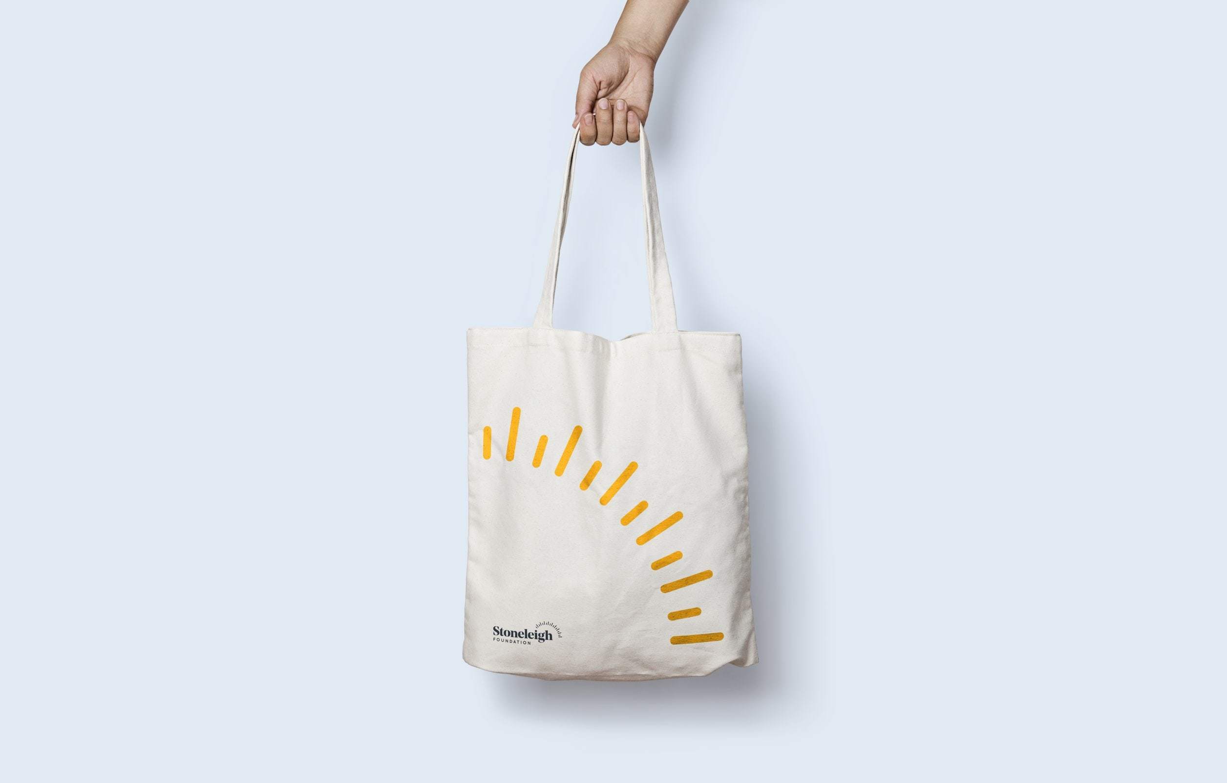
To celebrate Stoneleigh’s 10 years of supporting our region's thought leaders who ignite change around youth issues, we created an anniversary medallion that could be used to surface this milestone anywhere and everywhere.
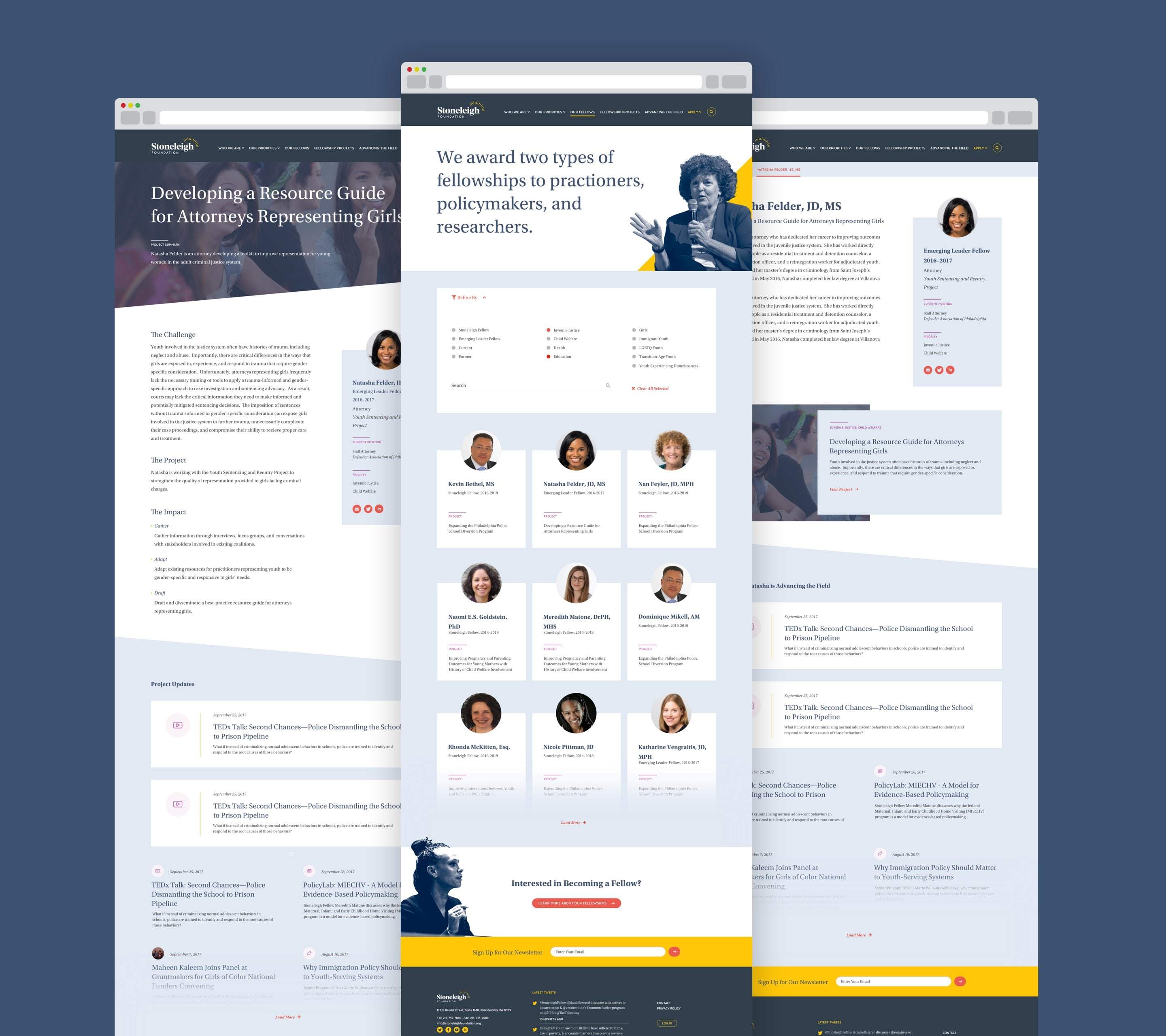
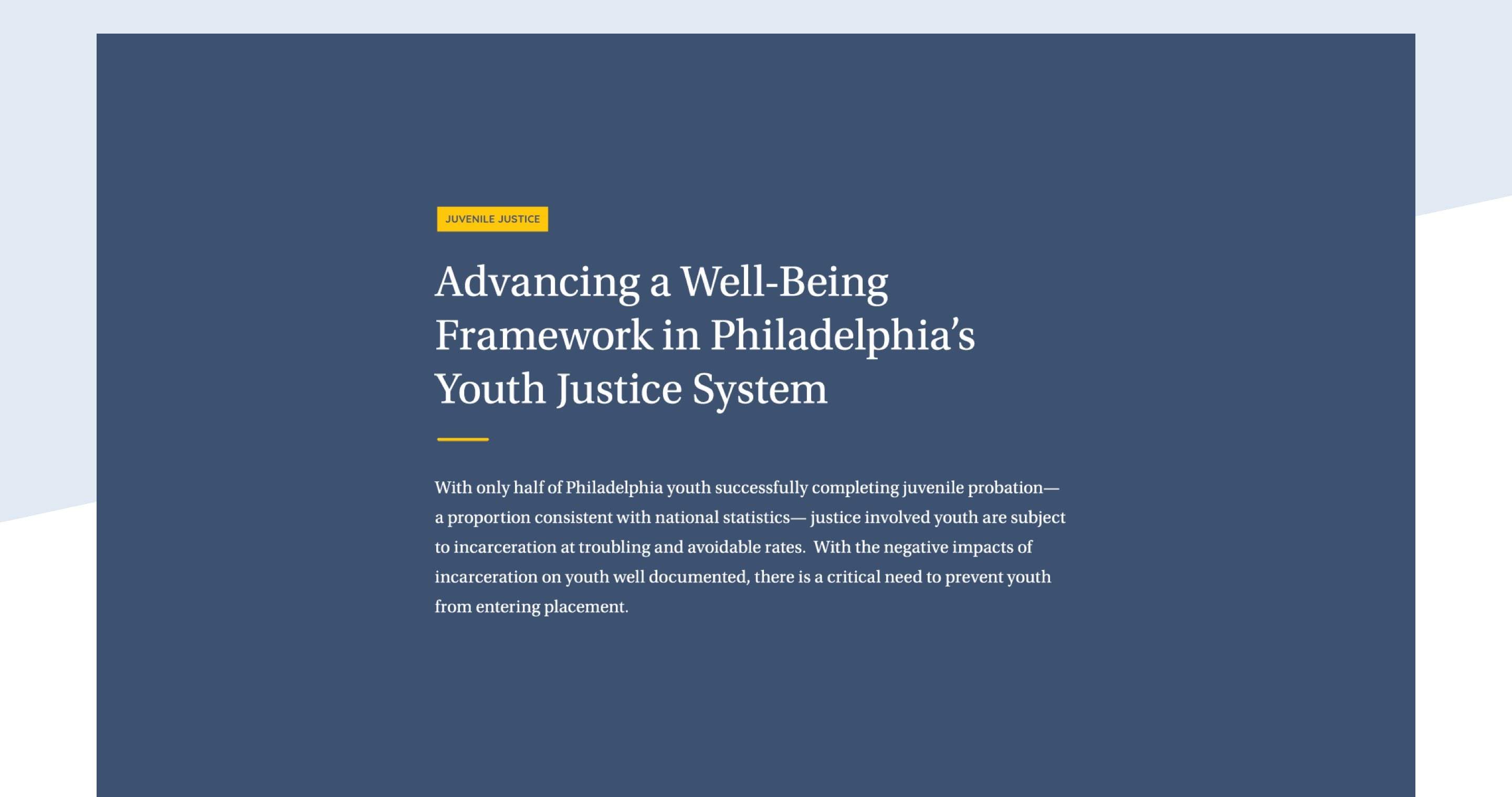
The Stoneleigh Foundation was founded to improve the lives of Philadelphia's most vulnerable youth. It accomplishes this by awarding Fellowships to exceptional leaders who create change in youth-serving systems to fuel long-term impact in the community. After 10 years the foundation began to reevaluate its existing brand messaging and materials. It realized that its website was no longer an accurate reflection of its work and people. Stoneleigh contacted us so we could start the brand overhaul.
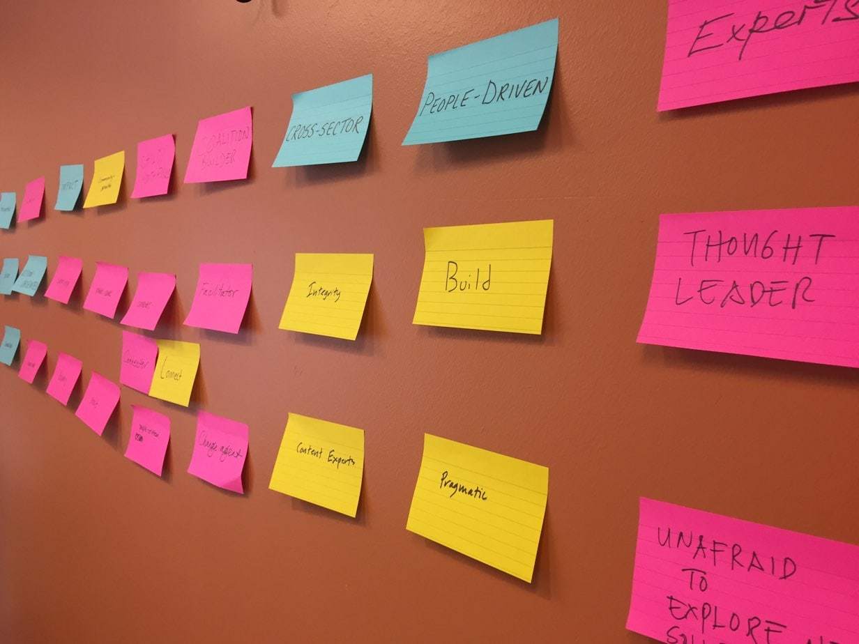
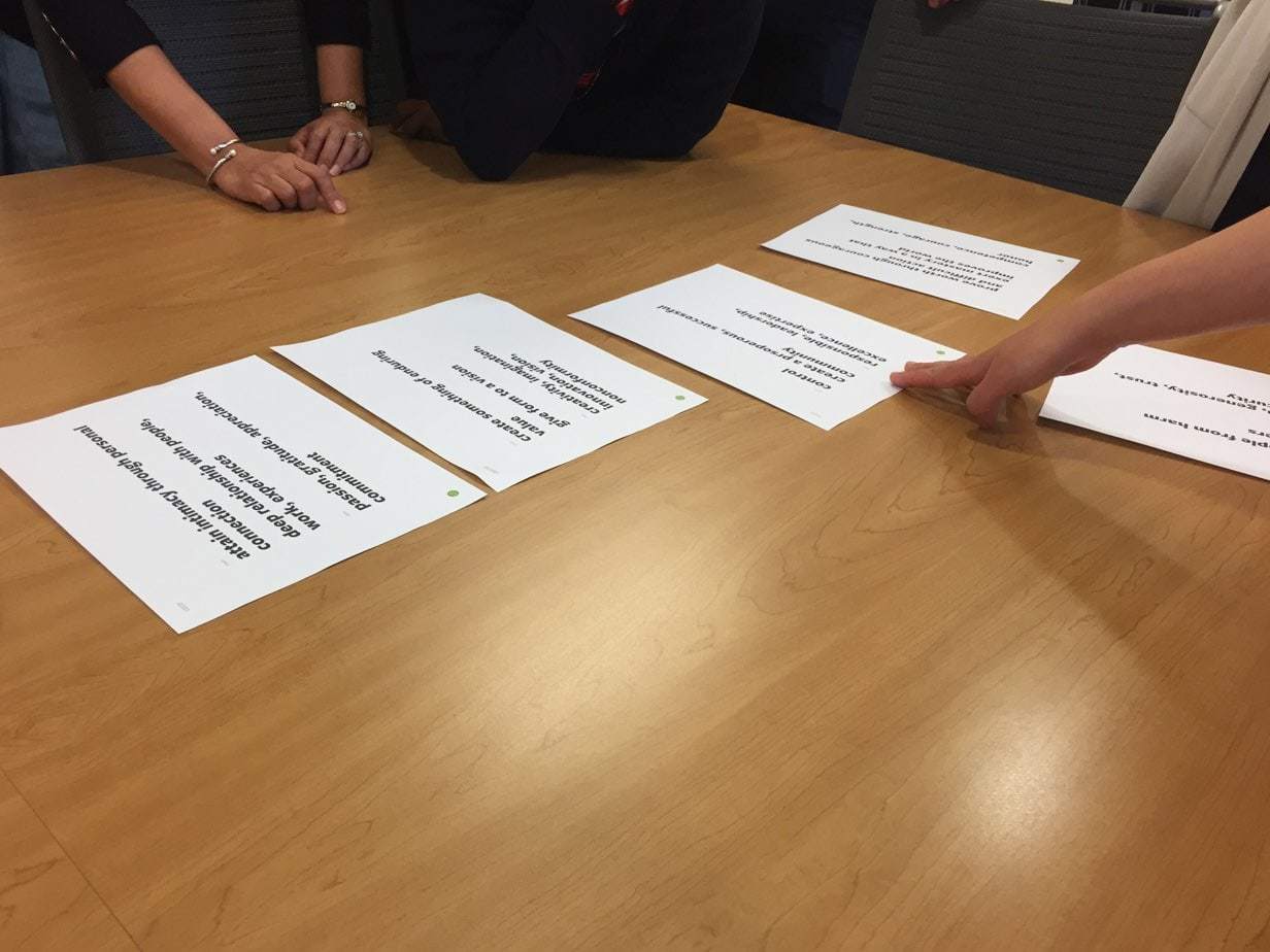
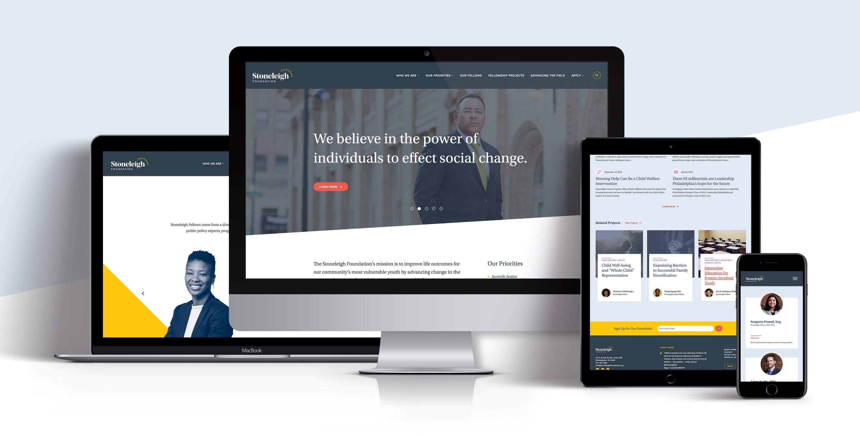
During our in-depth discovery process, collaborative workshop with staff, and insightful feedback from stakeholders, we gained a true understanding of the organization, its personality, and its fellowship program. Through careful listening and intentional refinement, our collective work resulted in a single approach that radiates hope and optimism, keeping the lead fellows front and center. This approach, affectionally named "hope rises" was applied to various applications. The rays in the resulting logo are made even more dynamic when rotated, scaled, and overlapped across various touchpoints in the identity. This allows for an engaging and cohesive brand identity that can be flexible over time.
To celebrate Stoneleigh’s 10 years of supporting our region's thought leaders who ignite change around youth issues, we created an anniversary medallion that could be used to surface this milestone anywhere and everywhere.
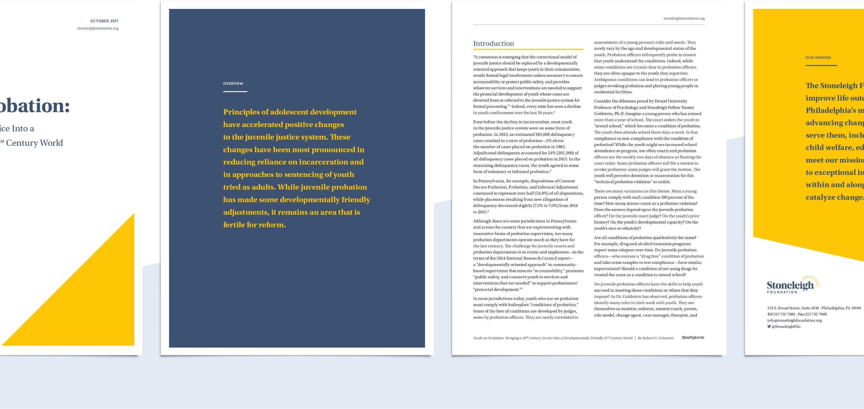
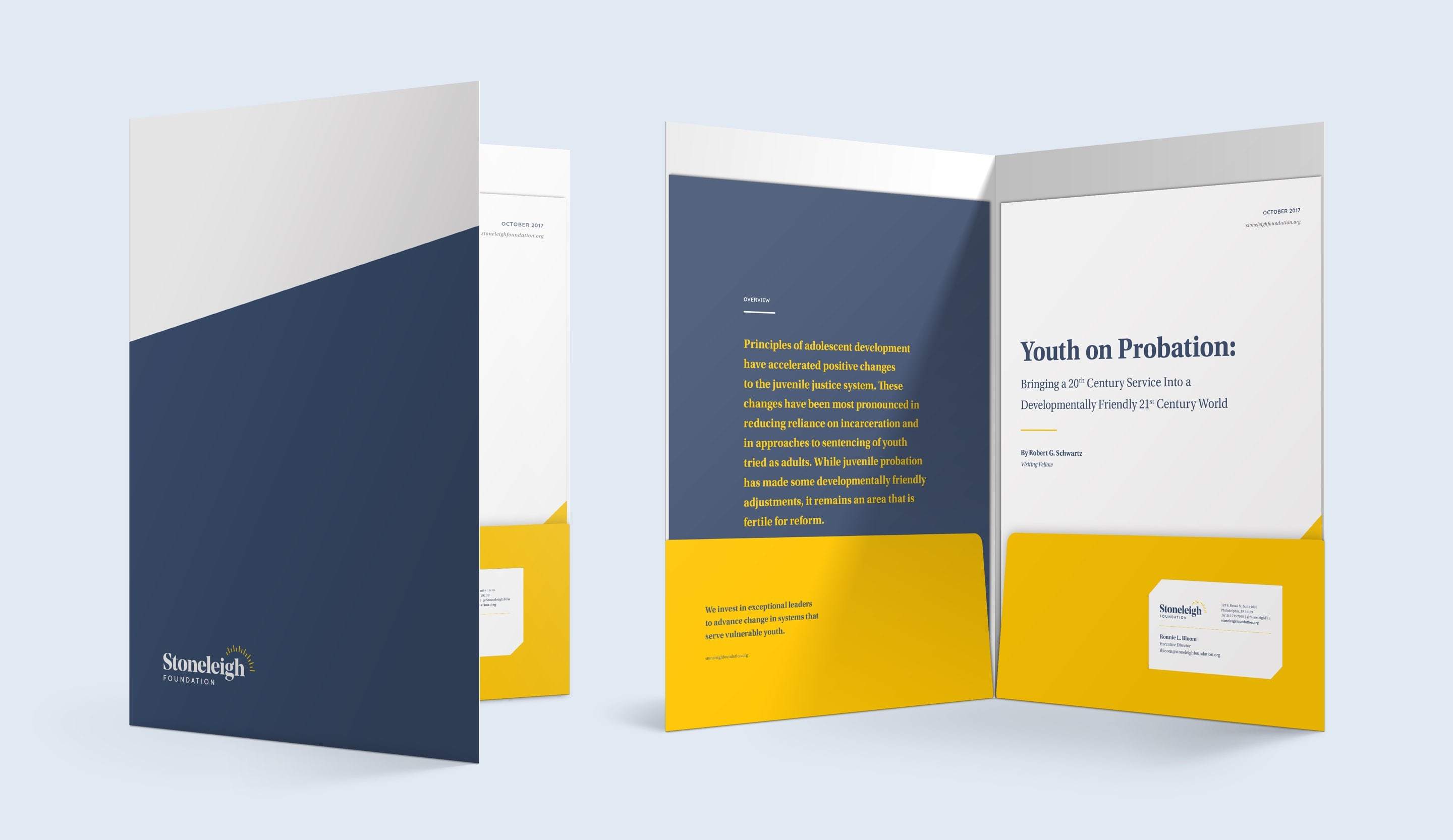

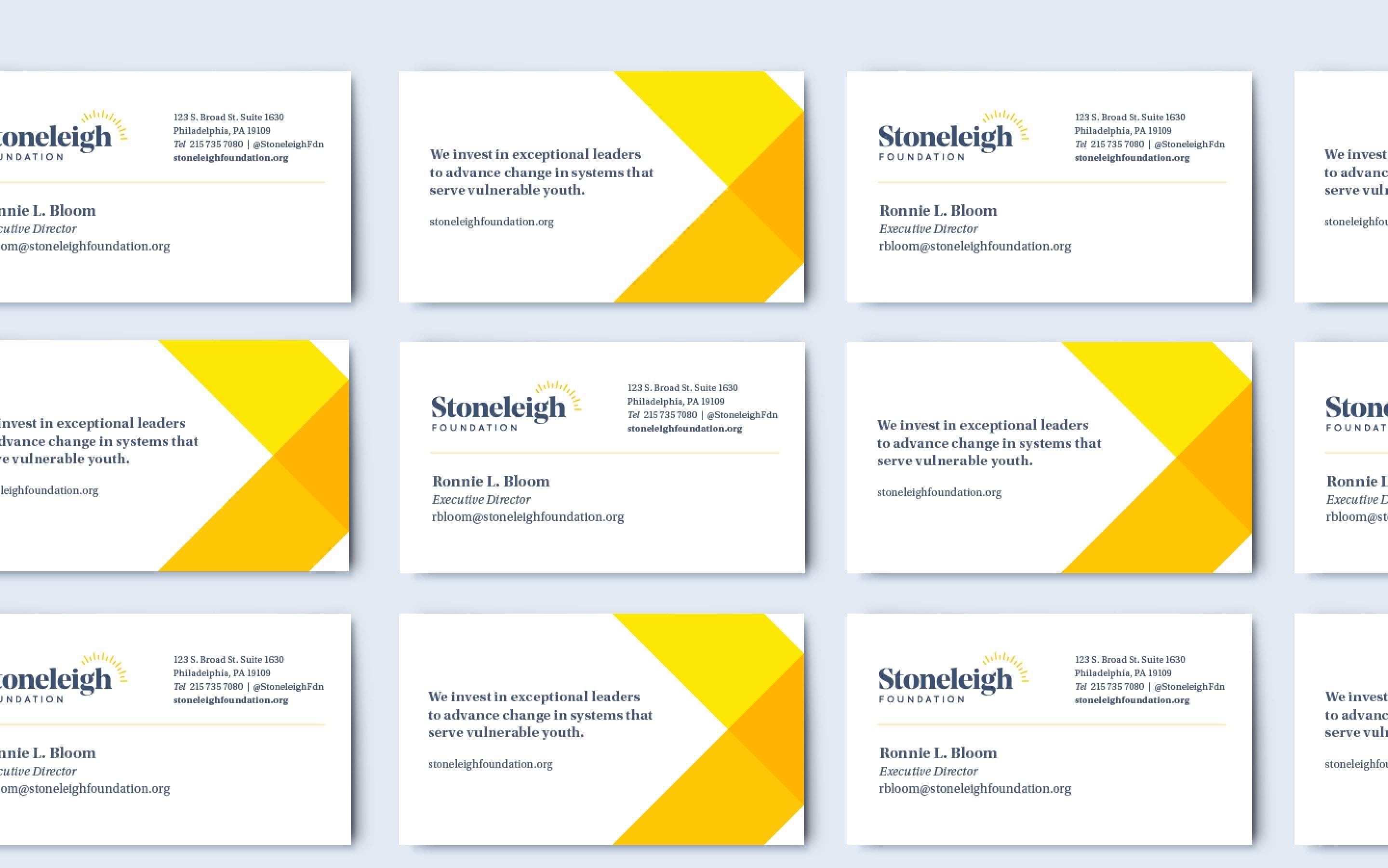
To reflect both the pragmatic side of the organization as well as its positive effects on social change, we chose a credible steel blue and an engaging orange-yellow as its primary colors. Three secondary colors were also defined to represent the teenage youth age group that Stoneleigh serves.
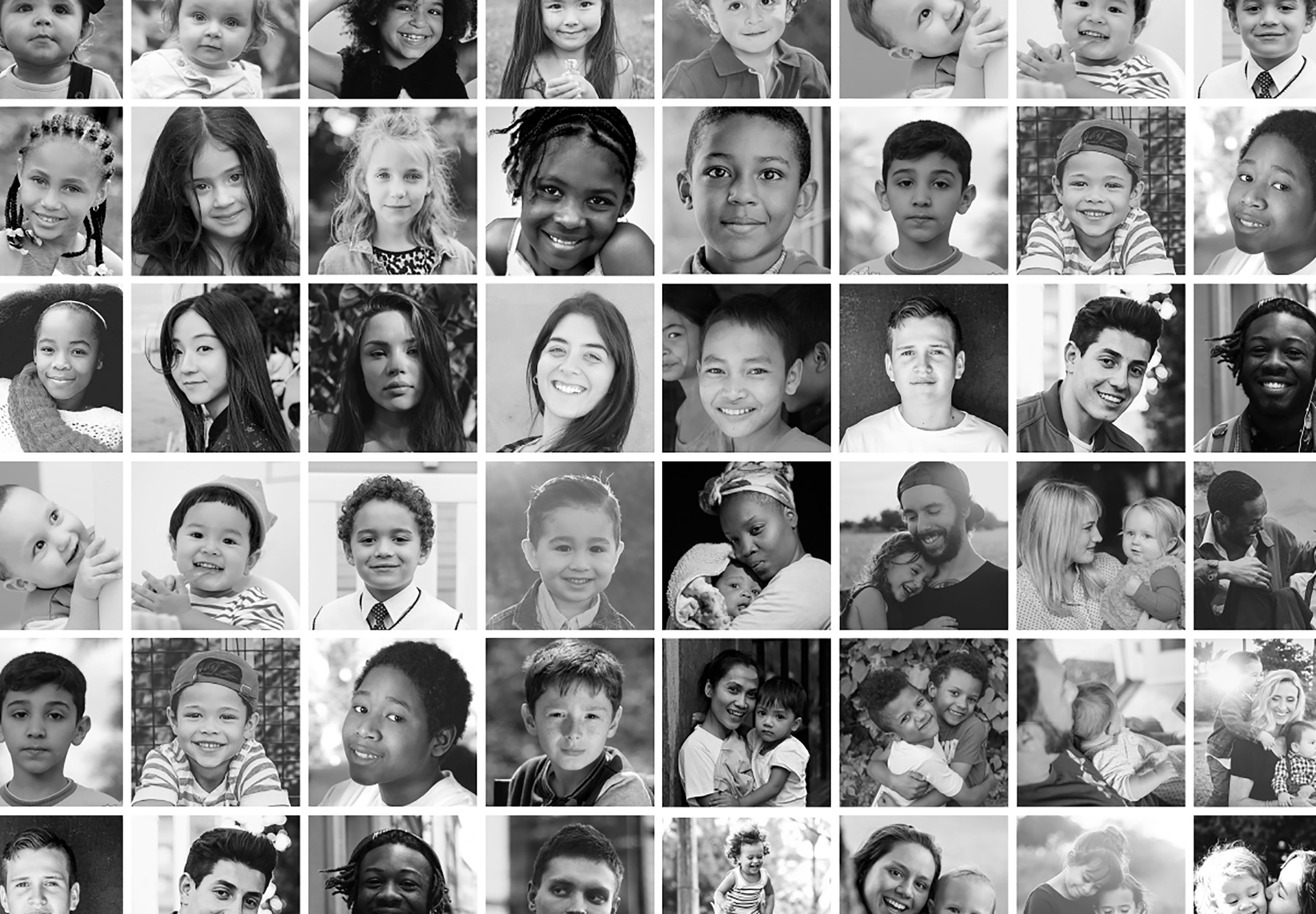
Fellowships are at the center of Stoneleigh’s mission and featuring the truly amazing and transformational work that stems from them was a top priority on the website. No matter where users may find themselves on the website, fellows and their projects are front and center. Both are organized using categories related to key issues and populations enabling easy filtering and search for end users.