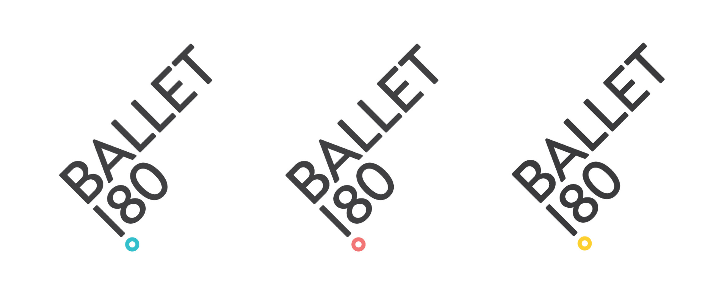
Ballet 180

Kindness, Activism, Humility

The Situation

Kelly Murray Farrell was the founder and artistic director behind three separate, but overlapping entities—Ballet 180, a professional dance company; Studio 180, a school of ballet; and Move 360, a community outreach wellness initiative. This multi-channel identity was confusing to understand and challenging to manage, causing slippery traction in the marketplace. What the studio needed was some outside perspective to help streamline its identity, devise consistent methods of communication with its disparate audiences, and advance its core belief to do good through mind, body, and spirit.

Our Approach

The studio strongly encourages people to use dance as a means for self-expression, self-discovery, and holistic well-being. We allowed these unique values to take center stage in the new brand to separate Ballet 180 from the crowd. Our first order of business was to reduce the cluttered architecture to ensure a singularly focused name to maximize visibility and create natural opportunities to cross-market. Aesthetically, we found the competition erred heavily toward neutral, black & white, and monochromatic color palettes paired with moody imagery draped in dramatic light and traditional serifed typography. These identities felt sophisticated and artsy, but they lacked warmth, energy and youthful curiosity…and no one could match Ballet 180's dedication to community outreach and its mission-driven point of view. This was the studio's differentiating factor.

The beauty of dance is conveyed through its graceful combination of motion, balance, and precision; a color palette that is energetic and approachable—a reinterpretation of classic primary colors; hand-drawn typography that creates a sense of movement and flow, and has the potential to capture unique personalities when executed by multiple hands; and layering high-quality photography.

Ballet 180 Logo Set

Pivot Point

A simple typographic approach conveys a multifaceted visual metaphor. The dot represents a pivot point for 180-degree transformation, an exclamation point for confident affirmation, and a ballerina toe point for figurative representation. It is bold, memorable and places a premium on the organization's name to build familiarity.

Ballet 180 Stationery Set
Ballet 180 Handwritten Expression | Body

Visual Vocabulary

If the page is the stage, the flowing, hand-drawn typography is the dance. Paired with a humanist sans serif that has a bit of a curve (precise yet friendly) the combined selections enable a high degree of flexibility from headlines to long text applications.

Ballet 180 Expressions Posters

Poster Series

Ballet 180 Handwritten Expressions
Ballet 180 Website on iMac

Mission Driven

We took Ballet 180's existing mantra and refined it down to three clear, repeatable, and memorable words—Kindness, Activism, Humility. These are used on printed collateral and posters in the studio spaces to promote positivity, healthy lifestyles, and community engagement.

Ballet 180 Website on iPad
Ballet 180 Nutcracker Sweets Event Collateral
Ballet 180 Charlie Brown Christmas Event Collateral
Ballet 180 Secret Garden Event Collateral

Proof

Kelly Murray Farrell

Untuck’s values meshed with our own, and they helped us to refine our name, brand identity, and mission. The work is top-quality and always delivered on-time; they’re very organized. Now we have confidence in our brand: we’re able to communicate who we are, what we stand for, and why were doing what we do.

— Kelly Murray Farrell, Owner & Artistic Director, Ballet 180

other projects

Featured Image from Neighborhood Progress Fund Brand Identity Design

Neighborhood Progress Fund

Community Impact Starts Here

Pccy Featured Image Gray

Public Citizens for Children & Youth

Speaking Out for Our Region’s Children

Featured Image for Penn Design Capital Campaign Strategy and Design Project

Weitzman School of Design

Lead By Design