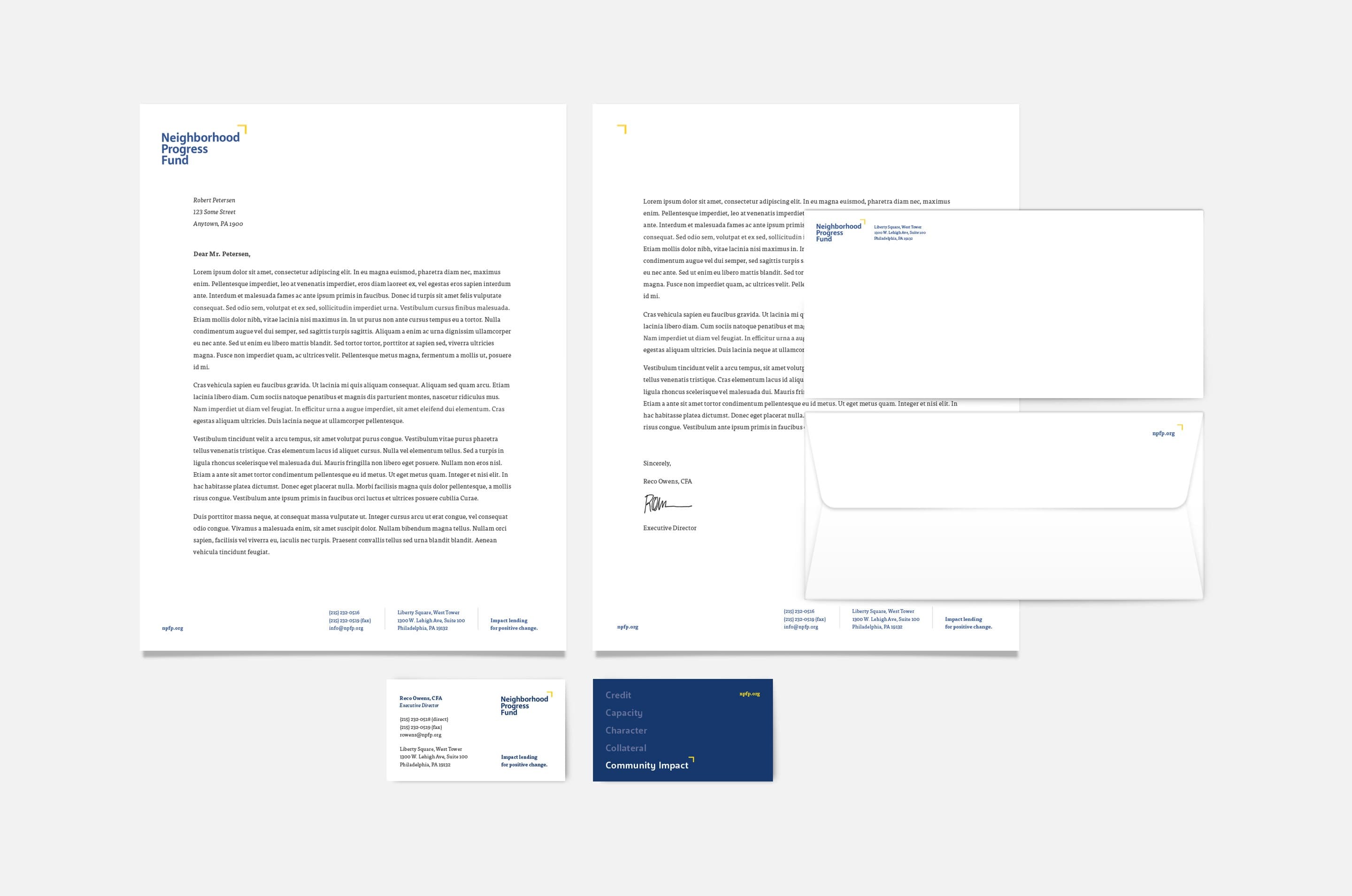
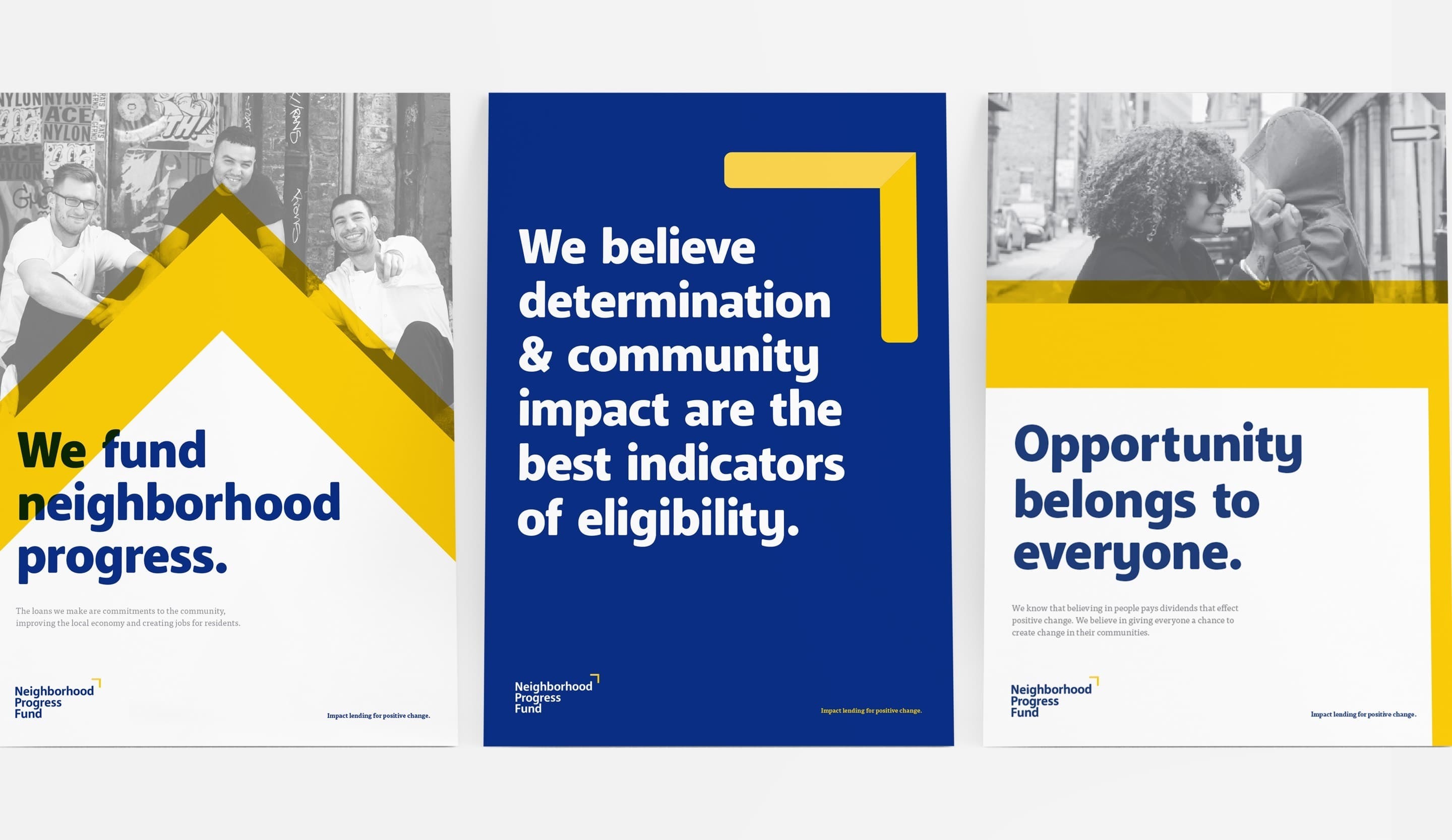
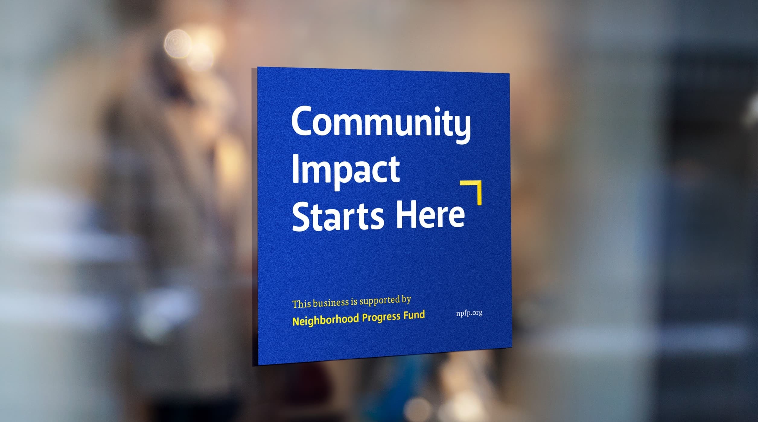
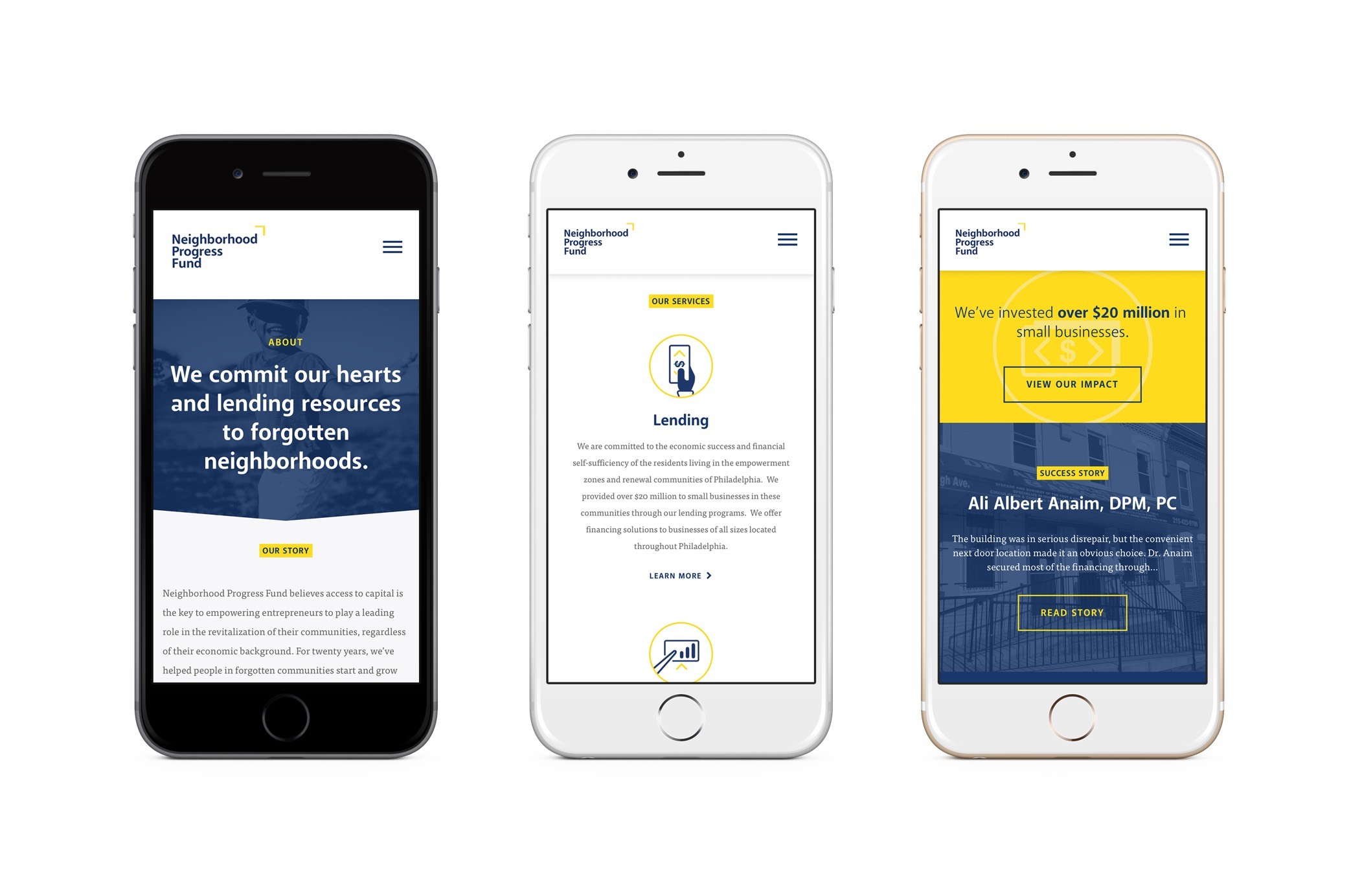
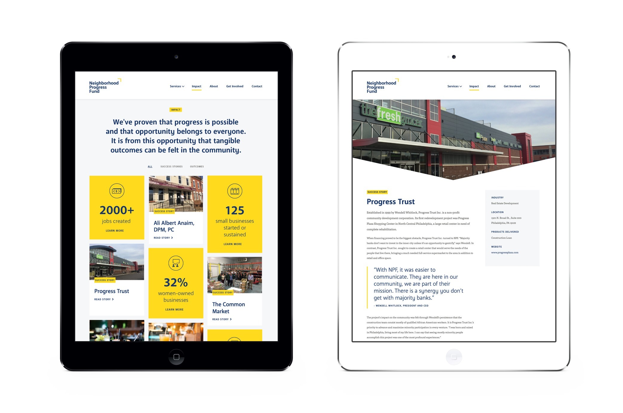
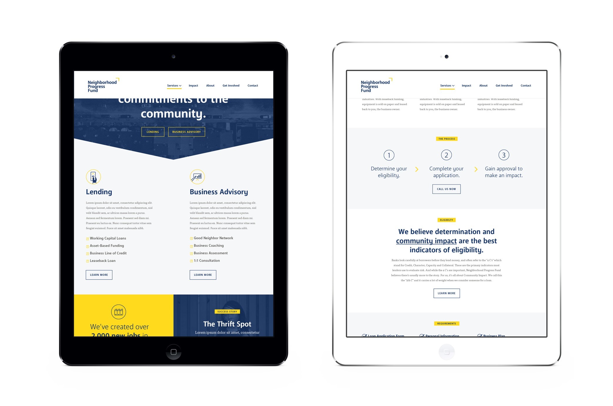
Neighborhood Progress Fund

Community Impact Starts Here

The Situation

Sometimes what is most needed is an evolution, not a revolution. When North Philadelphia Financial Partners (NPFP) approached Untuck with plans to redesign their website, we instead discovered an identity crisis that could not simply be overcome by a new website. The nimble nonprofit had been serving North Philadelphia for twenty years as part of a targeted city and federal government initiative to help stimulate economic growth in this distressed community by offering small business loans and business development services to entrepreneurs and their businesses. But with the expiration of the initiative, they quickly realized the need to more effectively communicate its offerings and expand its geographic reach for long-term success.

Our Approach

We typically recommend steering clear of acronyms due to their inherently non-descript nature, but in this case, we found NPFP actually possessed equity within the community. Our goal instead was to redefine the meaning of NPFP. This created an opportunity to reintroduce the brand while maintaining a degree of familiarity.

Introducing...Neighborhood Progress Fund (of Philadelphia) = NPFP

The new name is aspirational and speaks to its mission (community, collaboration, revitalization, and economic growth) while retaining its initials with room for expansion into other markets and its high-value URL (npfp.org). We then developed a relatable brand language that communicates infectious positivity, a genuine sense of community, and a deep-rooted pride in influencing positive change.

Npf Logo Fullwidth

Foundation

“Neighborhood Progress Fund” describes the outcome and defines the organization as a financial resource. Additionally, “of Philadelphia” allows the flexibility to expand to other cities without upsetting the name’s foundation (NPFP). The color palette is traditional yet unexpected. The dark blue is trustworthy; the yellow is hopeful and energetic. Together they represent the shining beacon of opportunity—because Neighborhood Progress Fund is not your traditional lender.

Npf Stationery Inline
Npf Progress Caret Splitcol

Progress

We selected and modified a soft-edged typeface that feels approachable yet stable enough to demonstrate reliability. In its purest form, the progress carat represents forward mobility and progress. When rotated 45 degrees, it becomes the roof of a house implying community and comfort. The mark is intentionally flexible, allowing it to move, scale, and separate to become a central element of the identity.

Npf Posters Fullwidth
Npf Supported Window Sticker Inline

Opportunity

The new site attracts customers through strong storytelling and inspires visitors to act by delivering a dynamic, emotional, and personable user experience. Key features include targeted forms to streamline general inquiries, loan pre-qualification, and service alignment; a custom Call-to-Action library that can be managed globally or on individual pages; and a highly modular content block system to build varied page layouts and with future scalability in mind.

Npf Web Slide 1
Npf Web Slide 2
Npf Web Slide 3
Npf Web Slide 4
Npf Web Wireframetofinal Fullwidth
Npf Website Layouts Fullwidth
Npf Icons All
Reco Owens Headshot

Our work with Untuck was nothing less than success. They guided us through a total rebrand turning ideas into assets—positioning us to stay competitive with our peers and win new business.

— Reco Owens, Executive Director, Neighborhood Progress Fund

other projects

Featured Image for Policy Lab Brand Identity Design Project

PolicyLab at CHOP

Converting Evidence to Action

Women Against Abuse Brand Identity Featured Image

Women Against Abuse

Striking Out Domestic Violence