Women Against Abuse

Striking Out Domestic Violence

The Situation

Women Against Abuse provides life-saving services to families experiencing domestic violence. Since its inception, it has become one of the largest and most effective domestic violence programs in the country, due in part to its culture of caring and innovation. For many years, Untuck has proudly worked side-by-side with the organization to bring consistency to its communication efforts through visual language (type, color, illustration, photography) and voice. As the organization approached 40 years of advocacy, it was on board to clarify its messaging and reinvigorate its visual identity to celebrate this momentous occasion.

Our Approach

We underwent a comprehensive brand discovery phase consisting of stakeholder interviews and an audit. Our aim was to distill Women Against Abuse down to its most basic elements and establish a unified messaging platform around safety, hope, healing, and empowerment. The resulting logotype illustrates its entire mission—to strike out abusive relationships.

The new brand is focused, strong, and dynamic, just like its organization. It has a resonant voice without being intimidating. It also highlights a key objective for Women Against Abuse—providing a voice of advocacy in action. Typefaces have been updated for the organization but the vibrant purple and teal color combination that we established years ago remains, having now become recognizable to its audience.

Waa Logos Before After Fullwidth

Women Against Abuse logo: before (Gill Sans) & after (Alternate Gothic)

Waa Logo Final Fullwidth

Inspiration

Peaceful protests and public demonstrations were another point of inspiration for the new identity. To envision teams of people raising their voices, waving signs against injustice, invoking a spirit of advocacy; that was the energy we wanted to capture.

Waa Signs Photo Inline

Visual Language

Abuse can be so multifaceted, taking on many ugly forms—shame, fear, isolation—which led us to complete the identity using additional words associated with domestic violence situations and the ways to combat them. We combined these positive and negative words with existing brand elements and the established color palette to energize and evolve the identity.

Waa Word Concepts Fullwidth
Waa Buttons Fullwidth
Waa Annualreport Cover Spread Fullwidth

Annual Impact

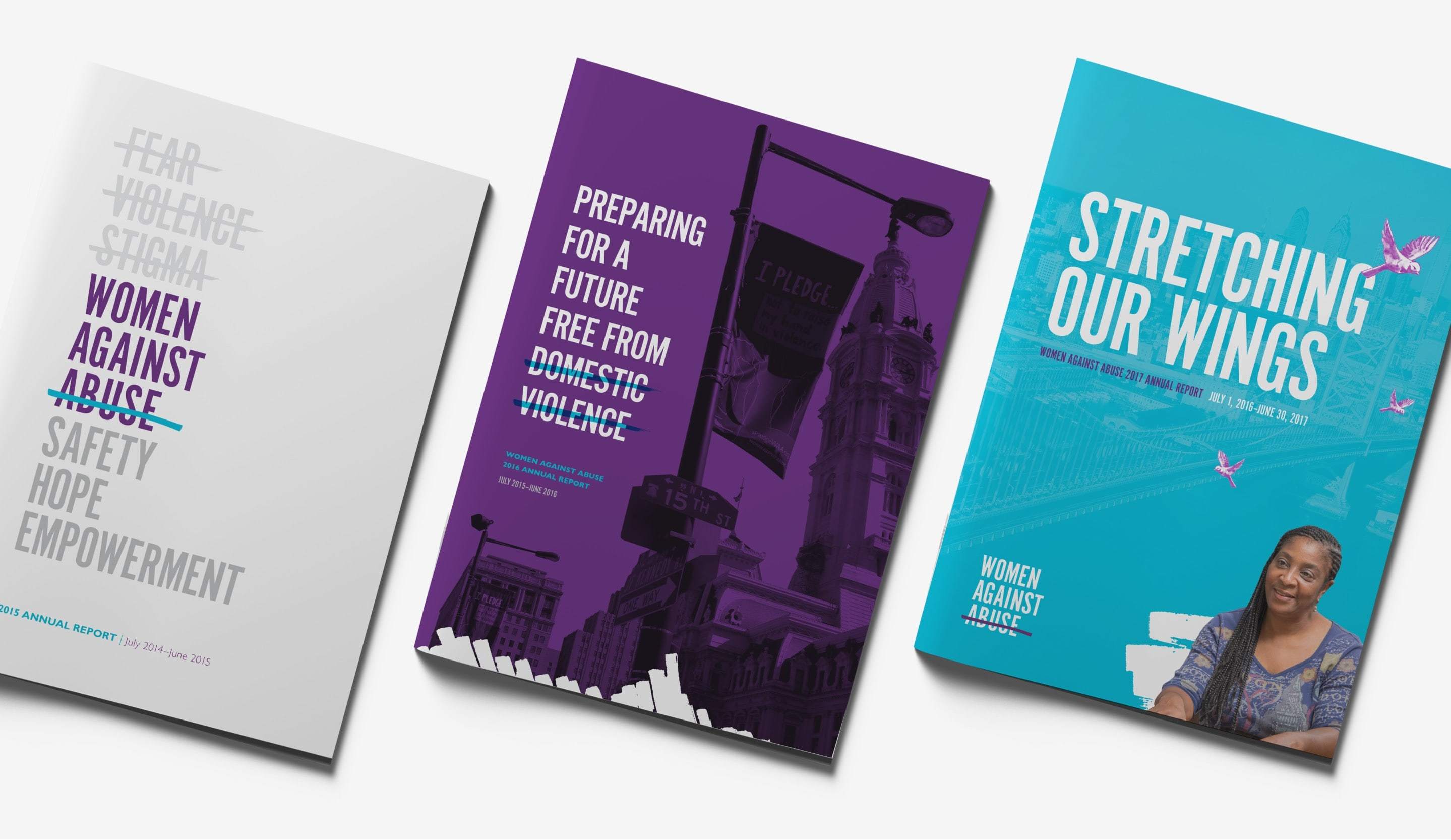
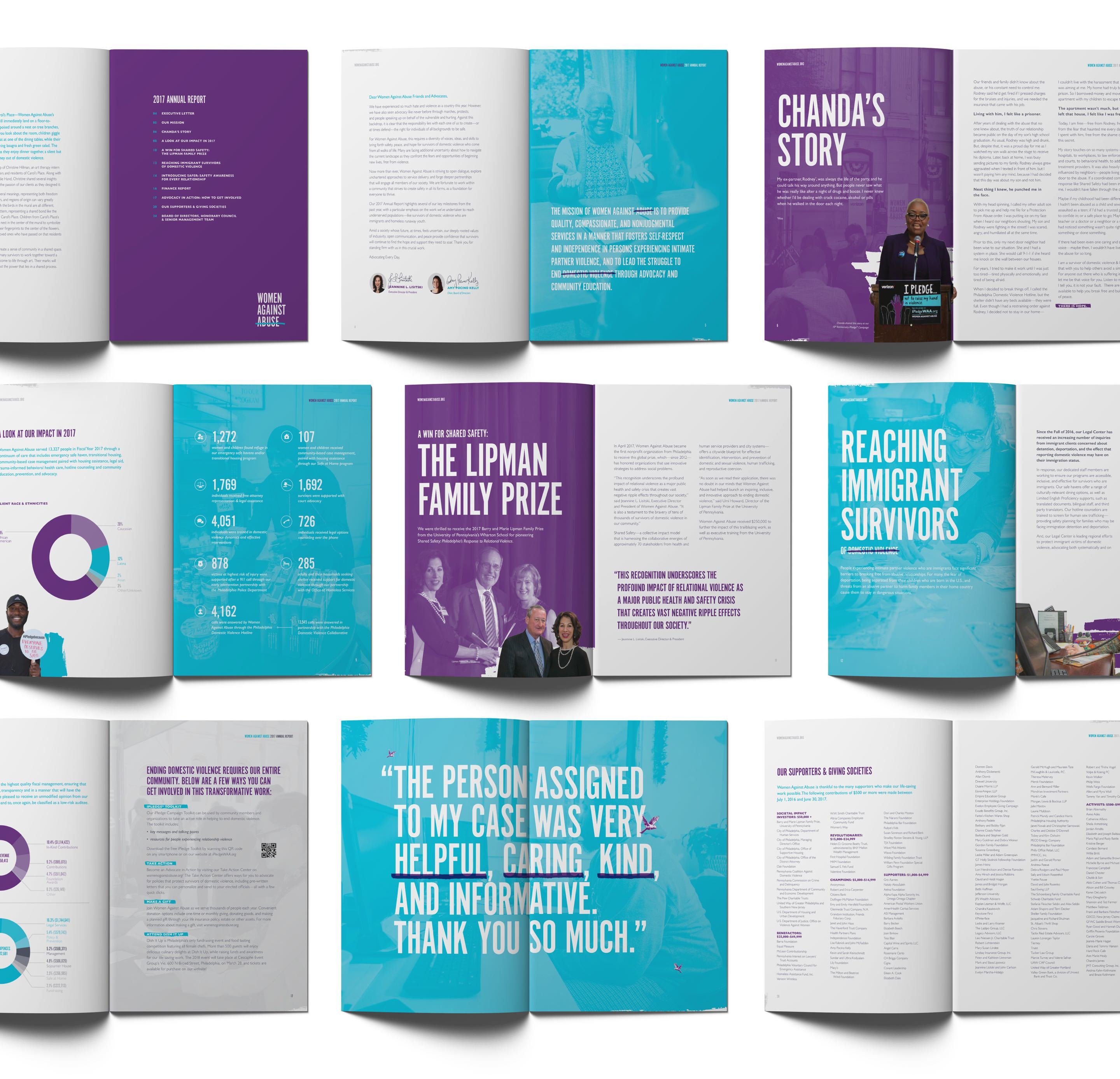
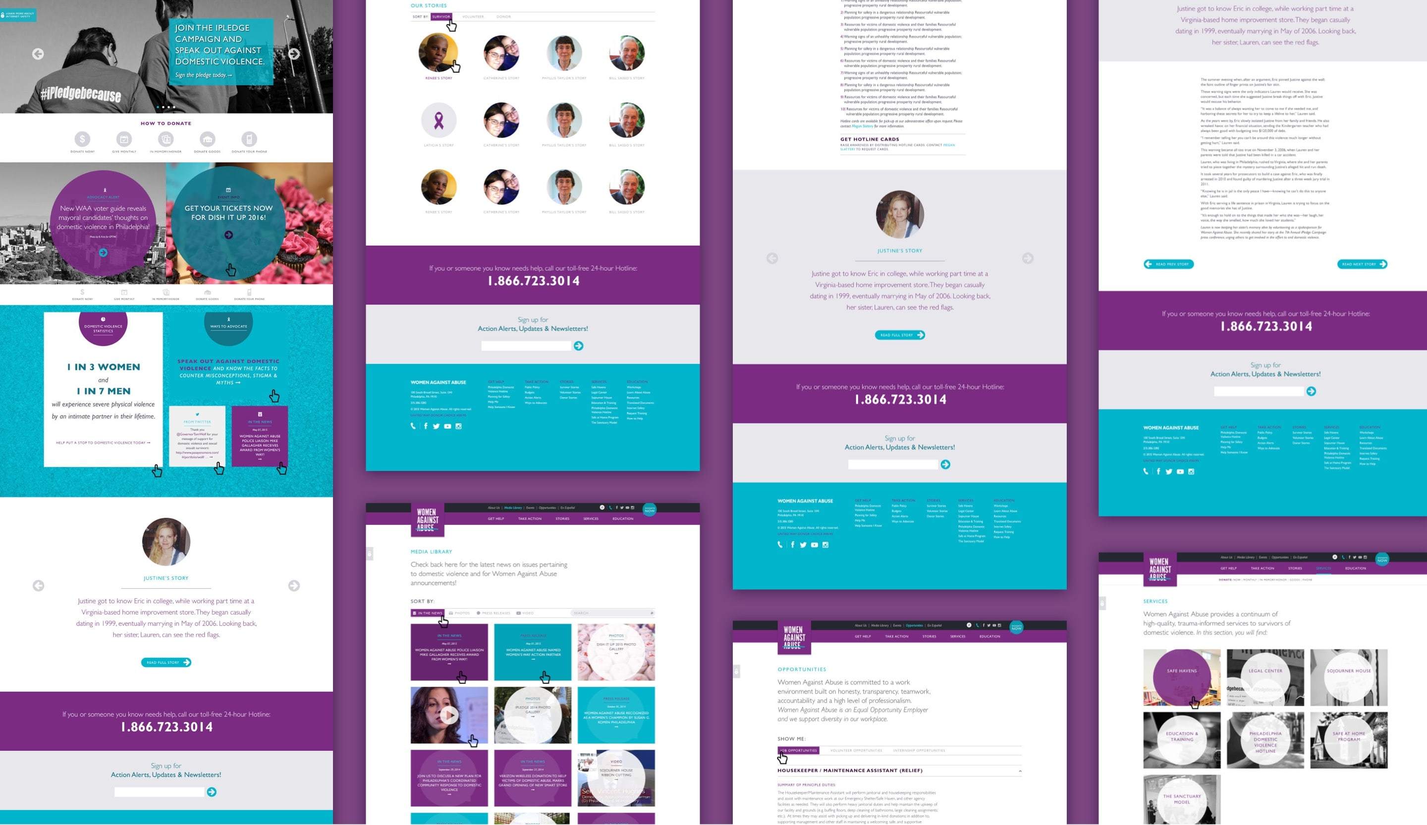
While the theme for each year's annual report changes, Women Against Abuse continues to provide a message of hope, action, and change to its constituency through its words and visual language. Uplifting photography and powerful survivor stories are weaved throughout the reports, highlighting the organization's focus on people by offering emergency services, transitional housing, program statistics, and financial data. Our goal is to fully express the positive impact that the organization has on the greater Philadelphia community.

Waa Annualreport Covers Fullwidth
Waa Annualreport Interiors

Powerful Stories

Women Against Abuse has a bevy of powerful stories to tell. It only makes sense to feature these stories within a medium that can evolve and change with the click of a button. Equipped with a fully customized Expression Engine content management system, the organization can share these survivor stories and initiate user action in a moment’s notice. The new website has proven to be an effective method of marketing the cause and increasing donations for the organization, year after year.

Waa Website Imac Inline
Waa Website Ipad 6Col
Waa Website Iphones 6Col
Waa Website Flat Fullwidth

Proof

Katie Young Wildes Headshot

We’ve worked with Untuck for more than 10 years and have been so pleased with how they’ve guided our brand evolution. Having a partner like Untuck frees us to devote our time, energy, and resources to fulfill our mission. And as a bonus, they provide fantastic customer support for time-sensitive issues.

— Katie Young-Wildes, Vice President of Advancement, Women Against Abuse

other projects

Featured Image of Mrs Snyder's Signage Design

Mrs. Snyder’s Market Cafe

A Healthy Appetite

Featured Image for Kleinman Center Brand Identity Design

Kleinman Center for Energy Policy

Envisioning a Sustainable Future

Featured Image for National Urban League 2016 Conference Design

National Urban League

Save Our Cities