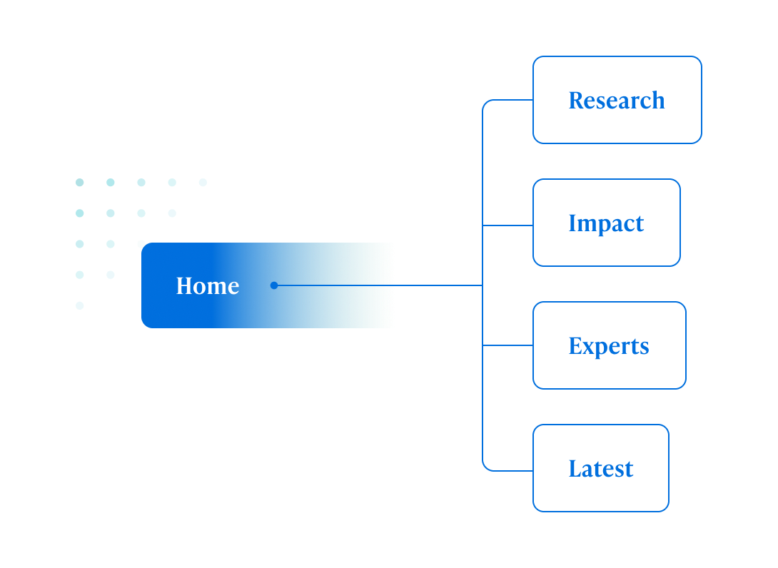
Center for Health Incentives and Behavioral Economics

Healthy Nudges

The Situation

The Center for Health Incentives and Behavioral Economics (CHIBE) at UPenn is a research center that helps to guide policy for governments, corporations, and organizations worldwide. Its vision of using behavioral economics as a driver for better health outcomes—higher-value, equal access health care and healthier lives for all—was something our team at Untuck could rally behind. CHIBE approached us to reimagine chibe.upenn.edu as a unified, digital destination that wholly represents the center and its work while leveraging modern technologies for better content management and delivery, higher engagement, and optimized performance. Our expertise was also leveraged in developing a visual identity and messaging that could carry CHIBE’s mission and vision forward.

Our Approach

By engaging with key stakeholders in workshops, surveys, and interviews, we determined high-level goals and audience personas for the site, explored user journeys and content maps, dissected and restructured content, and uncovered technical requirements. When it came time to develop the site's user interface, content delivery and management were at the forefront. To strike a balance between authoritative, established, and academic with modern, approachable, and dynamic (fresh), we expanded the existing use of green to a full palette of green and cyan tints that feel fresh and welcoming, grounded by saturated blues. The overall vibe of the site was inspired by CHIBE’s newsletter title, ‘Gentle Nudges’ which is reflective of the Center’s nature for incentivizing healthier outcomes. The result is an engaging digital presence within the Penn ecosystem with a strong emphasis on the collective of experts that carry its mission, vision, and social impact through the entirety of its work.

Chibe client workshop
Chibe ia top nav

Connecting Content

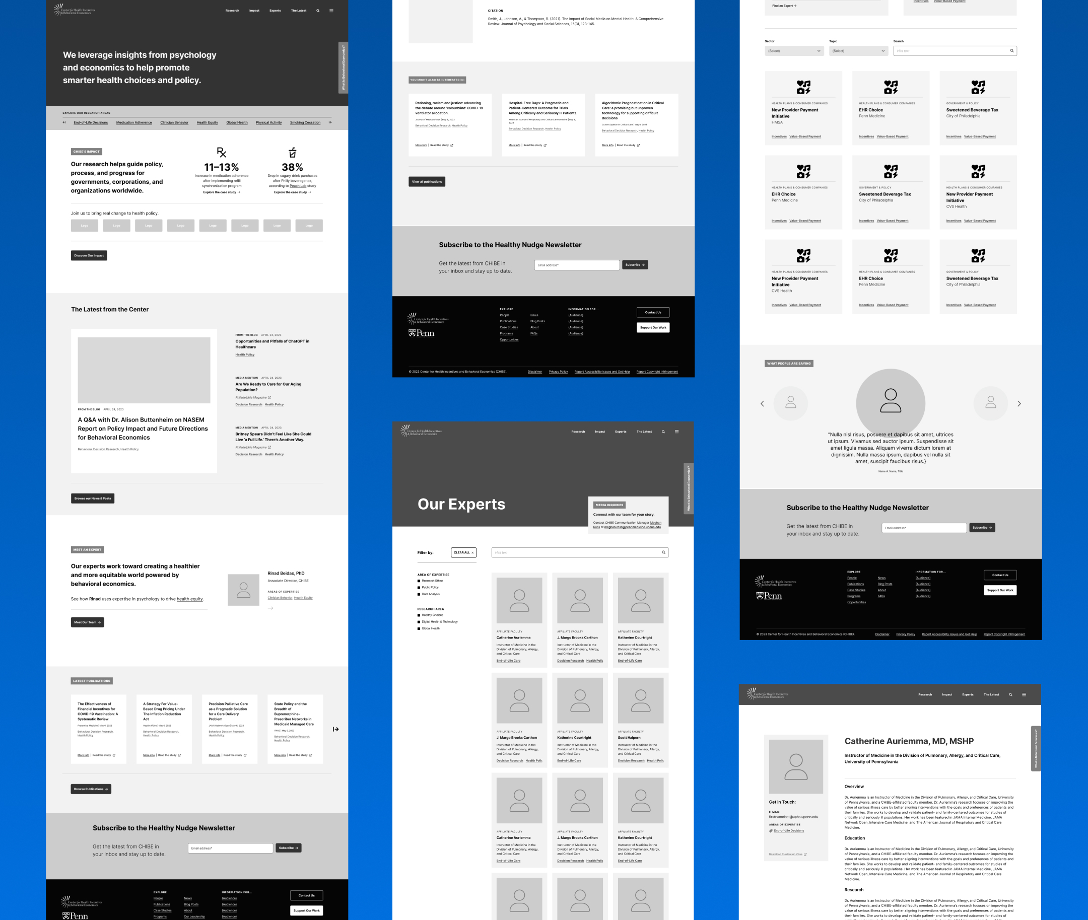
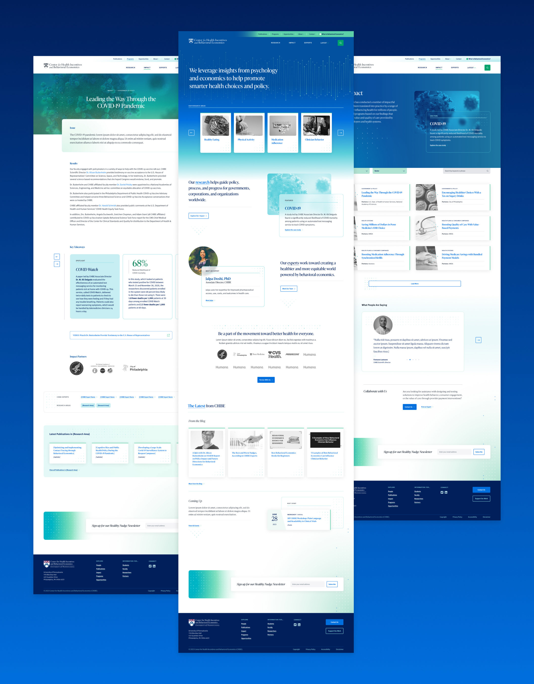
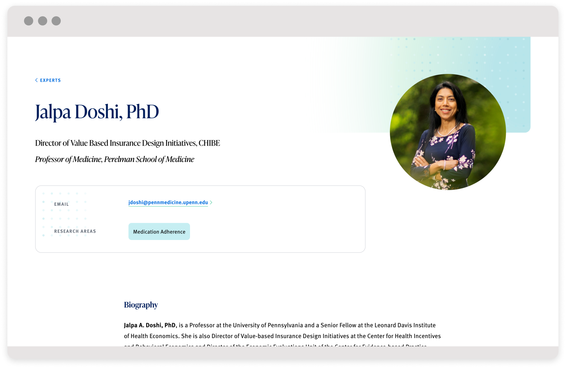
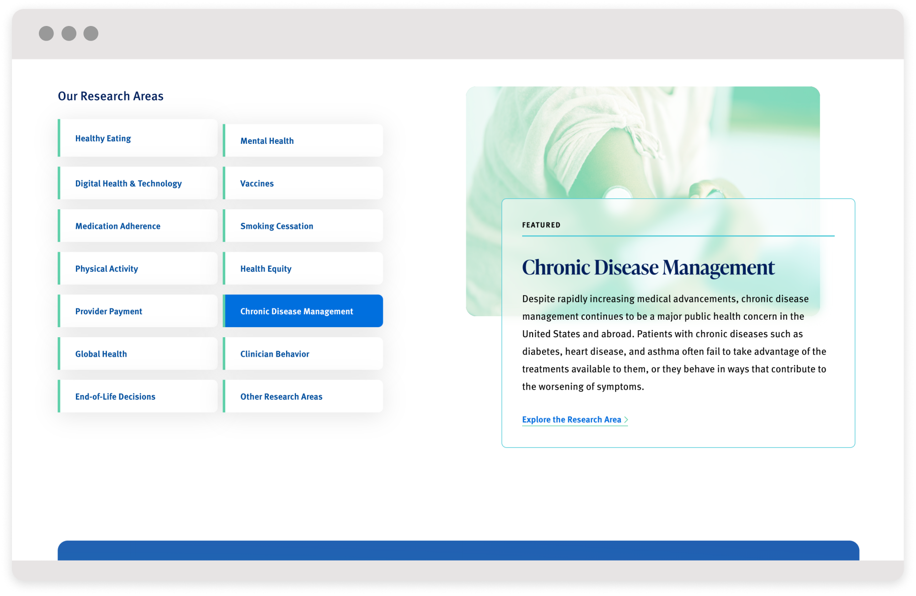
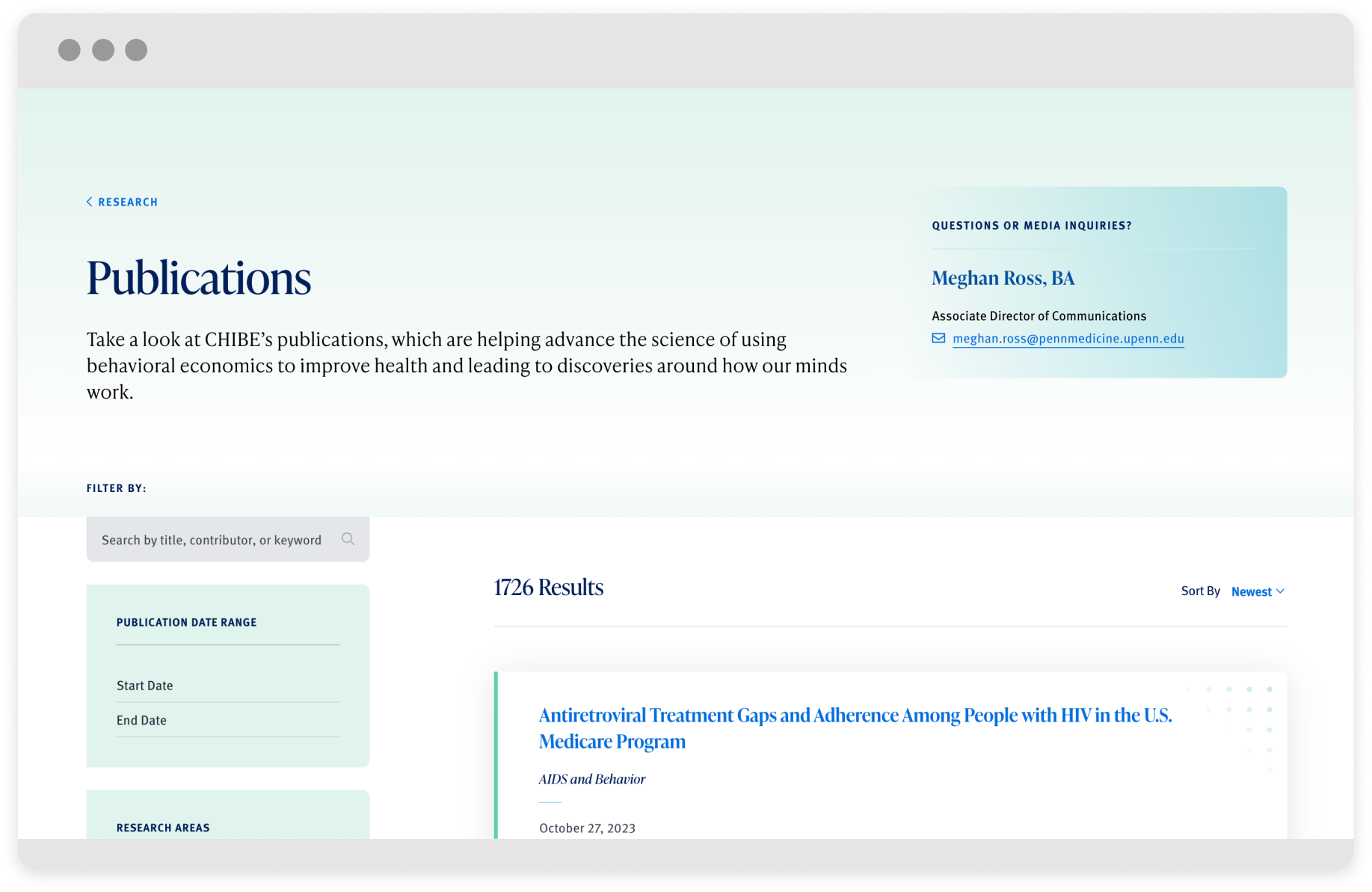
To help users find and connect related content throughout the site, we identified clear content taxonomies. We also surfaced high-value content that was previously buried or siloed to give users a more engaging and accessible picture of CHIBE’s mission and impact. And by offering more context with related research opportunities, we keep users on the site longer. More focused and robust case studies with consistent impact data allow CHIBE the ability to reflect the full attention and weight its associated experts give to them.

Chibe ui info panel
Chibe wireframes
Chibe type color

Striking a Balance

CHIBE’s team is both authoritative and approachable so it was important that the design of the site reflect that. We did this by providing plenty of white space and gentle color shifts, punctuated with select areas of deep color for high impact. We established a clear type hierarchy that introduces an elegant serif typeface for headings and titles with slightly rounded box edges to reinforce that approachability. Subtle animations for user interactions were created along with 'shifting data point' dot patterns that allude to emergent behavioral patterns and targeted interventions in CHIBE’s work.

Chibe pages desktop screens
Chibe mockup desktop 01
Chibe mockup desktop 02
Chibe mockup desktop 03

Other Projects

NUL Homeownership featured image

National Urban League

Home Is Where the Wealth Is

Untuck mastery charter featured

Mastery Schools

To the Top Together

Penn med featured image

Penn Medicine

Service in Action